The live site is at thebankofcanton.com.
The final mockup site is here. The sitemap button on the left side of the screen shows the various page templates and the initial phone view ports are in tabs along the bottom.
The final mockup site is here. The sitemap button on the left side of the screen shows the various page templates and the initial phone view ports are in tabs along the bottom.
The Design Process
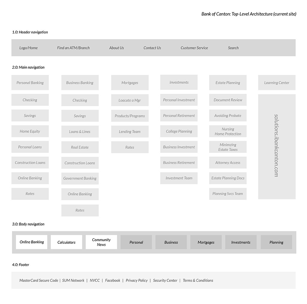
Phase 1: Mapping the current site Top-level architecture and developing personas for the various audiences: business bankers, personal bankers, mortgage seekers, wealth management clients.
Phase 2: Creating home page desktop wire frames based on personas and their site paths.

Wire frame 1: Features large background image and focuses on Mortgage customers.
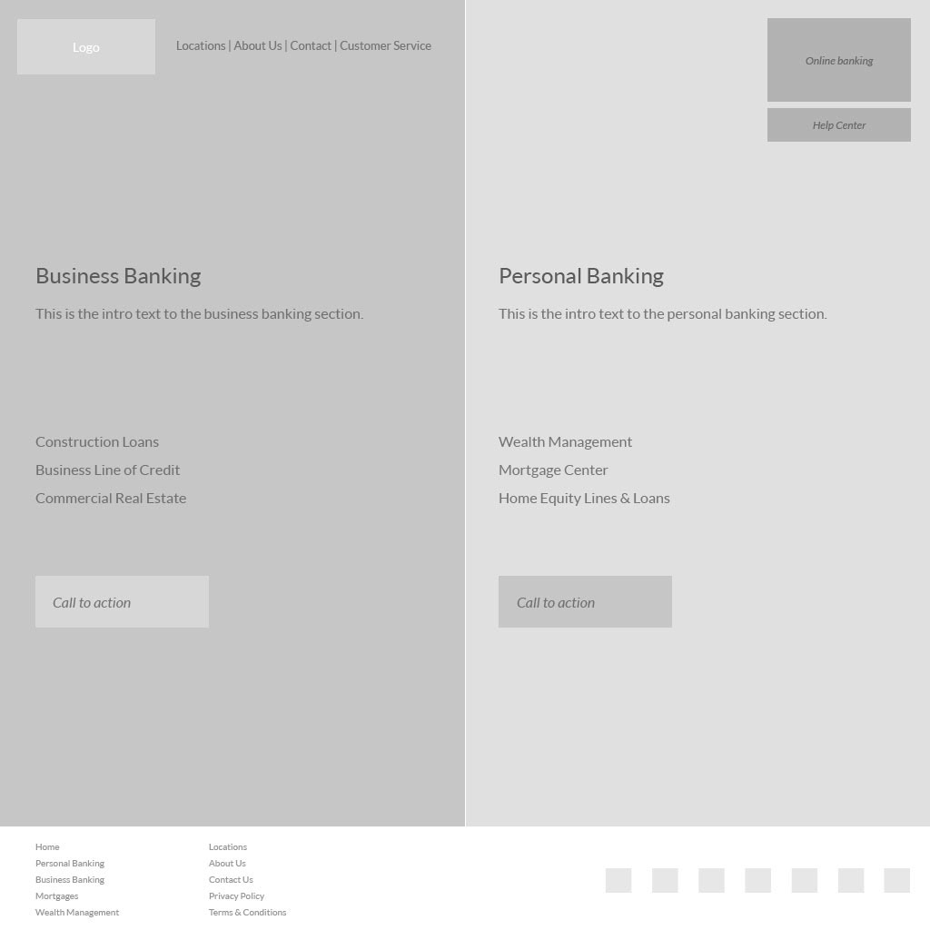
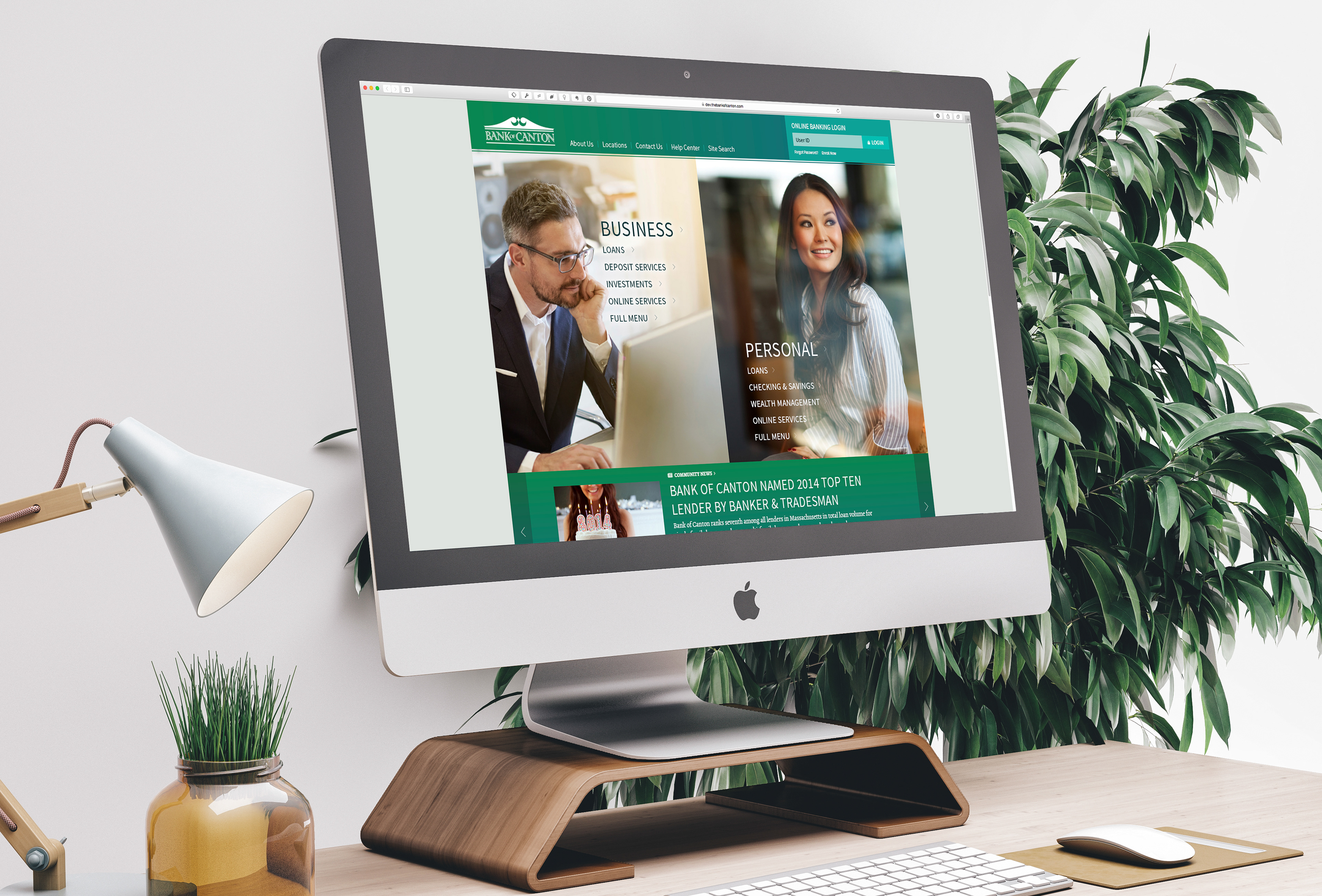
Wire frame 2: Features split screen and focuses on Business and Personal Banking customers.
Phase 3: Color palette exploration based on The Bank of Canton corporate green. (center)

Phase 4: Create home page layouts based on the wire frames, creative strategy and personas. Create initial navigation UI mock ups in UXPin.
Home Page Layout Version 1
Home Page Layout Version 2
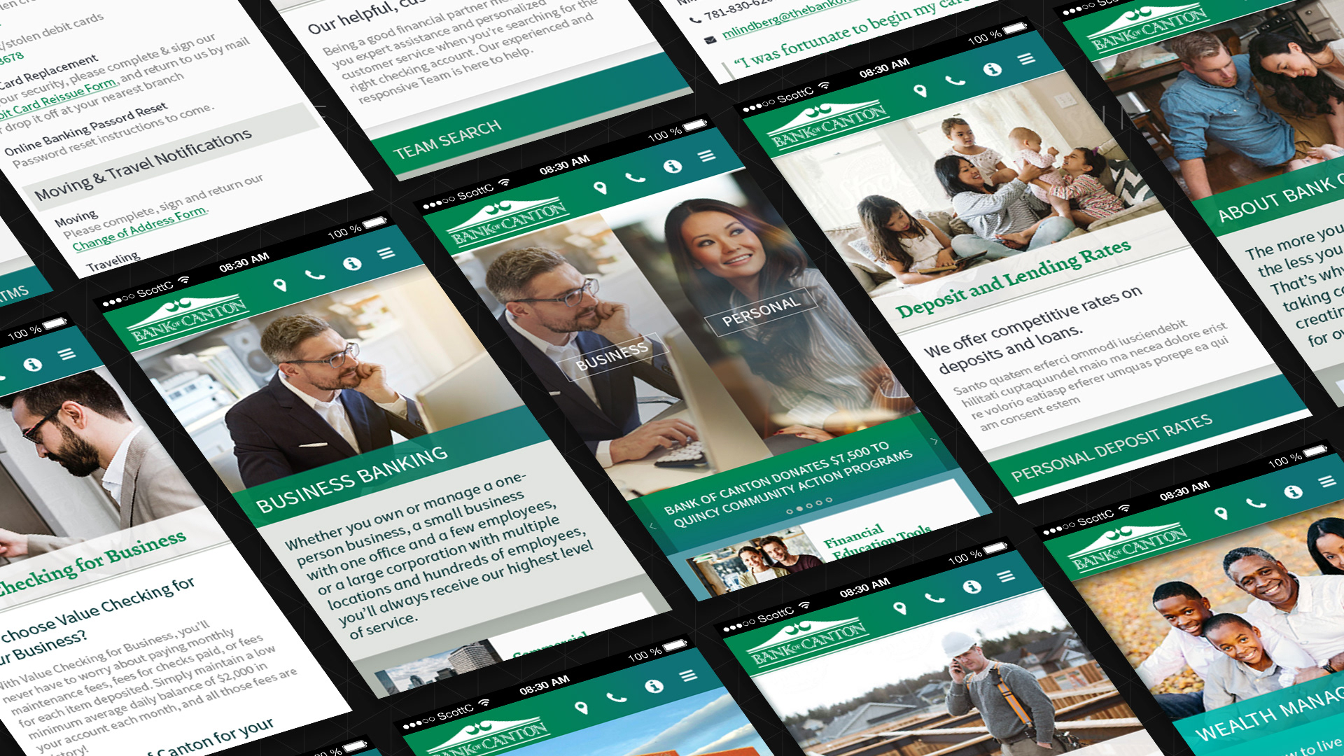
Phase 5: The split screen layout was chosen, and the next phase was to refine the layouts and UI, develop secondary page navigation and template grids. Simultaneously, the mobile view ports were created and mocked up using UXPin's alternate views. These are visible in the demo site.
Navigation refinement, News slider mock up and UI development for overview pages.
Select Page Designs
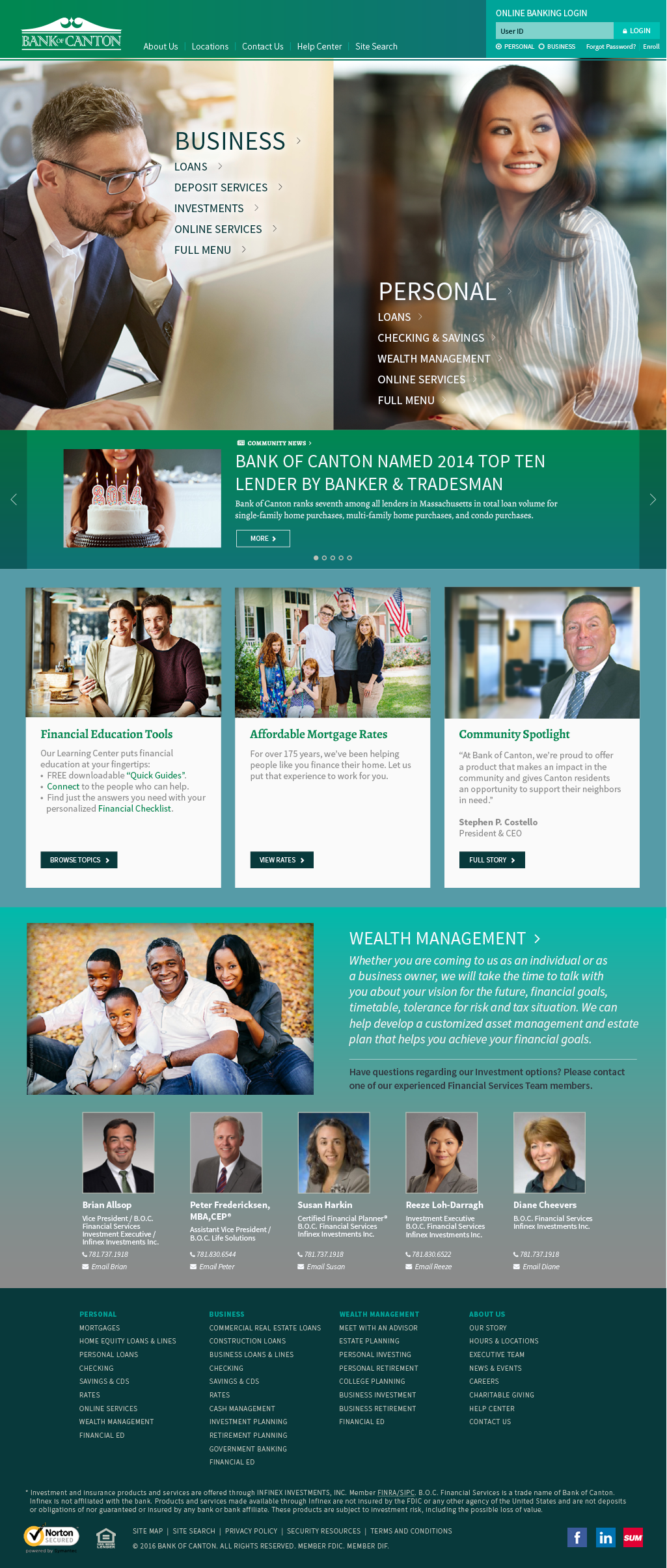
Home features multiple sliding panels, an auto collapsing header, news slider, feature boxes, product highlight and footer with expanded navigation to improve SEO and user experience.
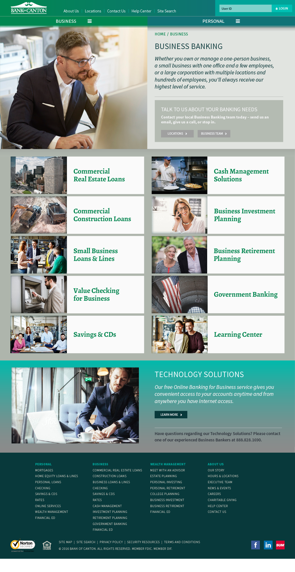
Business Banking Overview serves as a high level quick assessment of all business banking products. Each corporate division has an overview section: Business, Personal, Wealth Management and each includes a feature section below the product list to cross sell other divisions.
Personal Checking product page features several card-based sections, tabbed content and a cross-sell feature area.

Help Center features phone numbers for lost credit or debit cards, other often used information such as making payments. Also includes an FAQ accordion.

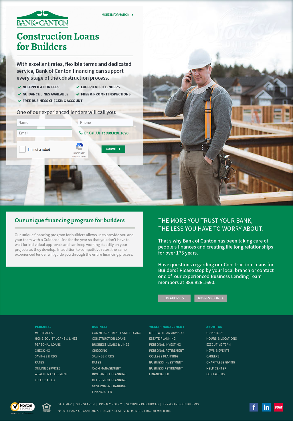
Landing Page template is simplified to focus the viewer on one task by removing the navigation bar and creating a simple form to drive customer through the sales funnel. The WordPress template is customized to allow a left or right placement of the headline box.
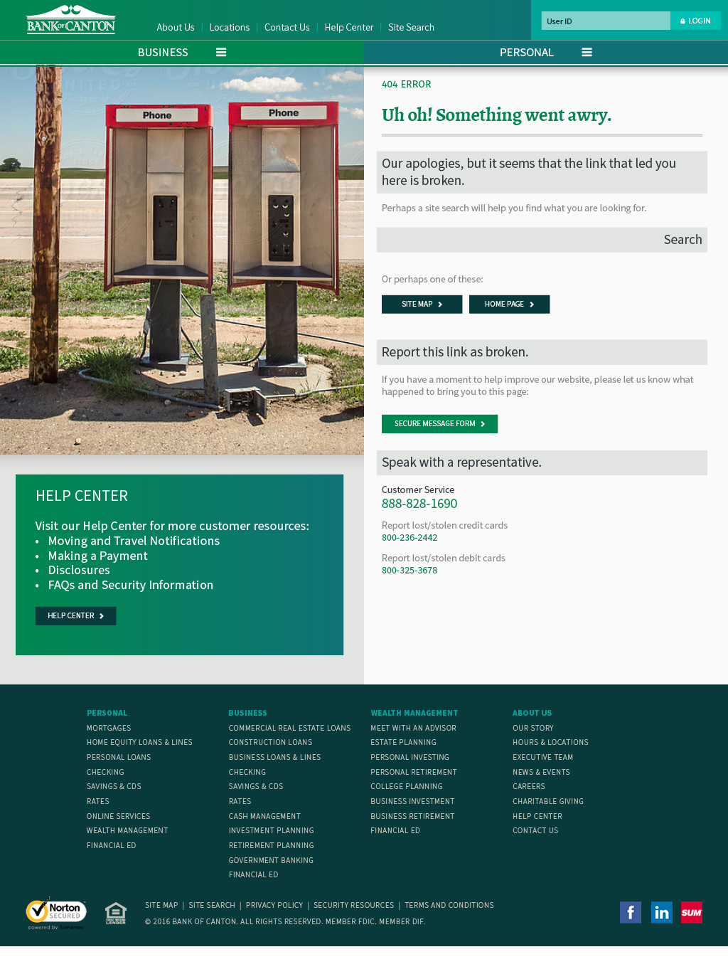
404 Not Found is a crucial part of any site, however, too many are treated as dead ends. In order to improve UX, I featured a playful image and included links to frequently needed information, a way to report broken links and a customer service phone number. (imagine that!)